Centre Name: Norbury Manor BEC
Centre Number: 14343
Candidate Name: Sabrina Boukhalfa
Candidate Number: 9202
Unit: G321
Monday, 31 March 2014


Friday, 28 March 2014
Evaluation - Question 7
Evaluation 7: Looking back at your preliminary task, what do you feel you have learnt in the progression from it to full product?
Looking back at my preliminary task, I have seen a drastic
improvement as I have learnt the codes and conventions of a Pop magazine. This
is made obvious when comparing the two media texts I have produced over the
past year, my Preliminary task to my final product.


I created a music magazine for my foundation portfolio and an educational magazine for the preliminary task. Between the two, a vast improvement is evident when looking at my music magazine as it appears more realistic because of the codes and conventions present which gives the magazine an overall established look. On the other hand, my college magazine lacks believability due to the colour scheme especially the font colour. This is because my colour choices for the text (pink, black and white) do not give the magazine a professional look as through research; I have found that you would usually find magazines of this genre to have a basic colour scheme such as black, white, red etc as the simplicity of the colours helps make the magazine appear more professional. Because of this, I assured that the colour scheme for my final cover was appropriate by conducting further research into pop magazines for example Q magazine, top of the pops, Billboard etc and I analysed the different colours used throughout. In doing this I was able to understand what an appropriate colour scheme should be.
When
looking at the different cover photos used on both products, I have found that
the image used on the music magazine is of better quality due to the clearness
and sharpness of the image as my photography skills have improved over time;
resulting in a more advanced finish. This is because by the time I was required
to create my final piece I had already become more familiar with the camera and
had learnt different techniques and modes. For example portrait, landscape, outdoor,
indoor etc which in turn helped the quality of the images to look more
professional.
The
models used in both magazines are looking directly into the camera which was
done purposely in order to create a connection with potential buyers. Their
facial expressions are both positive as they can be seen smiling which helps to
create a welcoming and friendly atmosphere.
In
my music magazine the smile is used to connote a bubbly personality as pop
music is a more positive and up lifting genre of music and this was done
purposely in order to make obvious to the audience the genre of the magazine.
For
my college magazine the model is smiling in the hopes of showing the target
audiences ‘parents’ that the students that attend the college are happy as they
appear to be thriving and eager to learn.
Editing
the images for my magazine cover took around 1 hour to do for my preliminary
task as I had vague understanding on how to make the image appear better where
as for my music magazine I was able to adjust the exposure and lighting for my
cover photo using Photoshop. From when I was using Photoshop In my preliminary
task - which I has no understanding on how to use the software, to when I was
editing my cover photo for my pop magazine, my skills on Photoshop had advanced
a whole lot more.
Both
my magazine covers weren't very clear on what the theme of each magazine was.
As you can see for my preliminary magazine we can see that the student’s
environment is outside a school which straight away indicates to the reader
that this is an educational magazine but the models appearance does not make it
obvious to the viewer that she’s a student, usually in a school magazine there
would be a more obvious statement to show its a school magazine for example a
student holding a book/books, or doing work in a lesson, but I had failed to
show that. Looking at my music magazine the model isn't the one showing the
reader its a music magazine instead the features around her are doing that and
the headline at the top of the page states very clearly that it is a music
magazine as its shown very boldly at the top that it is ‘THE UK’S #1 MUSIC
MAGAZINE’. Also my research on pop magazines have shown very few artists doing
anything to represent anything musical, usually they are just posing so that’s
why I followed that convention and just had my artist smiling in a
close-up/extra close-up shot of her. So even doe both magazines weren't very
clear on what the theme of both magazines were, I still justified why my music
magazines image wasn't obvious what the theme was.
When I compare the two layouts of the contents pages,
it is clear to see that they are both vastly different.

The preliminary contents page is
simple and the information on the page is very limited, the actual content on
the page is un-realistic for a real life magazine because you’d usually find
almost a page or list of content. Where the page numbers are allocated they
have not all been lined up, also the images on the other side of the content
appear odd as there is one more space beneath the last image but that space hasn't been filled in. In comparison to my contents page you can clearly see it has a strong structure and layout, I had planned where all my images were going
to go and I've planned how much space I needed to leave to fit in my text, the
overall look of the page looks convincing as a contents page.

it is clear to see that they are both vastly different.
Evaluation - Question 6
Evaluation Question 6: What have you learnt about technologies from the process of constructing this product?
Thursday, 27 March 2014
Wednesday, 26 March 2014
Evaluation - Question 3
Evaluation Question 3 ‘What kind of media institution might distribute your media product and why’?

Evaluation - Question 2
Evaluation Question 2 ‘How does your media product represent particular social groups?’
Evaluation - Question 1
Evaluation Question 1 : In what ways does your media product use, develop or challenge forms and conventions of real media products?
Thursday, 20 March 2014
DPS Feedback

DPS Feedback:
Josh Catiglione: I like the double page spread you've created using Photoshop, it appears to look professional and neat and its not to crammed with graphics and text which leaves a lot of space around the model. The shot you've taken of your model is very sharp and crisp, the lighting is shining on the correct angle of her face leaving shadows on her face which makes particular features of her face stand out more to me which I think was effective. The UK in the background was a clever idea and I like that its faint so it doesn't draw any attention away from your artist, by having the UK in the background has made it obvious that you're referring to her as a UK artist so that was a good use of a graphic.
Naomi Dawson: You've done a great job for your Double page spread, it looks so professional and I think it could pass of as an established magazine page because you've followed all the codes and conventions of a pop magazine e.g. you've included her name in the corner, you've added in a pull quote, the columns are neat and beside each other and you have a small text box on the left hand side at the bottom of the page telling me that the photographer of this image is you and that seems really professional to do and I would see all these conventions in a real magazine.
Katrina Astor: I really like it! I haven't got many negative comments to say except I would prefer the interview text to be a little larger as I can read it too well, but other than that I love your double page spread, your image choice is perfect because its so clear. I like that you've put a white text box behind each of the columns so I can read the text better and finally the pull quote you've used from your artist about her being '"rebellious" really interests me and makes me want to know more about her so that pull quote was very effective.
Wednesday, 19 March 2014
DPS Layout
Draft Plan - DPS

My final draft plan for my Double Page Spread has been significantly helpful when designing my real double page spread and I've kept to the layout of my flat plan as much as I can.

The pose of the model on my flat plan is exactly the same as how I initially planned her to pose like, also the shot type that I intended to take my model from was a mid-shot which I succeeded at doing.


I placed my model on one whole side of the double page spread just like how the other Double Page Spread has Taylor Momsen - the model placed on the left side of the two pages, I think this is an effective way of making it obvious to the reader that the whole article/interview will be of the that model as she's the first thing they see.


Tuesday, 11 March 2014
Artist Interview
Interview:
“She reminds me of a young Kelly Clarkson”, “I love her already!”, “Seriously, I want to know where she’s performing next, I’m obsessed already” these are just some of the comments that we caught being said after watching Megan Lindsay’s performance at the MEN Arena in Manchester - January 2rd 2014 with an audience of 22,300. Megan Lindsay has kicked of the New Year with a great start having already released two singles including a music video and she’s been booked to perform at some of the UK’s largest venues such as the O2 arena, Finsbury park, London arena and she’s about to release her upcoming 2014 album, Star Dust.
For C Magazine‘s spring music issue we had the chance to interview the singer, to touch on a number of topics including her style, her music, her idol Miley Ray Cyrus and more. I started of the interview asking her how she has been dealing with the media and being under the microscope of the public where they can capture any slip ups via internet. She comfortably tells me that “I haven’t had any problems, yet. I know I have to be cautious with the media as they can be intrusive in peoples’ lives” her reply seemed so mature, especially for a 17 year old but then we see the other side of her when she goes onto saying “but I’m still my own person so I’m gonna live my life how I intend to, not how the media expects me to, I’m still young after all”. Well she’s not wrong about that, they can’t physically control her actions but they have a way of limiting such behavior as paparazzi have a way of capturing any celebrity misbehaving! Coming from a networked world, automatically places everyone, especially celebrities in a position of exposure to the whole world.
Lindsay has been in the spotlight for a while now, being Britain’s Biggest New Talent. She’s been mentioned in countless amount of magazine and has featured on the covers of Entertainment Weekly, Billboard, Blender and Spin. So we spoke to her about how she’s coping with being such a young artist and working for such a demanding career with all the pressures, and has to dedicate her life to and how she handles this, “I think starting my singing career at an early age gives me an advantage”...“because I have so much time ahead of me, and to learn more about how to grow in this music industry and handle myself”. I question her if she’s capable of handling herself in this huge music business because of the lack of experience and she replies, “Well I have all the experience that I need from my manager Martin Kirkup, he works with some of the greatest artists of today like Katy Perry, Adam Lambert and lot’s more, so I trust him with all my heart ... I’m also signed to such a great music label that provides me with a strong management team of producers, publishers, organizers etc, but mainly having such a supportive caring manager helps me greatly”.
Hearing Lindsay talk so much about her music career, got me wanting to know what she does to un-wind and have fun, “I do exactly what every other teenager does to have fun, got to the cinema, hangout with my friends, go to the shopping mall and party! Just because I’m a ‘celebrity’ now doesn't mean I don’t do normal teenage things just to fun”.
You use to sing when you were younger at your local church; would you say that you are very religious now?
“I wouldn't say that I’m a strong Christian but I still maintain that connection with GOD, because believing in a higher power just gives me a sense of protection, and I will always know that there’s always someone I can turn to, to ask for help and guidance”.
Do you remember the first time you heard one of the songs you did a cover of on the radio?
“Of course I do! I was in the car with my mum on the way to the shopping mall to buy my prom dress, and the cover I did of Ellie Goulding’s song “Explosion” came on. I couldn’t get over the initial shock of hearing my voice actually coming from the radio, and when the song finished the radio presenter ‘The Bassman’ started to actually talk about me, and my YouTube channel where I upload all the covers of other songs I did. At the end of the day I checked my YouTube channel, and I was shocked, millions of views and likes on almost all the cover songs I had done and 2 million new subscriptions. I owe my career to Capital FM radio station, just for playing my cover, without them I don’t think I would be where I am in my career; singing for a living, producing my own songs and performing at amazing venues, this is the life I thought I’d only dream of”.
Putting music aside there are rumors that, you have been approached about acting in a film?
“Yes. To be honest I never thought that acting was of any interest to me, so I was going to turn down the offer but my Manager try to persuade me otherwise, he kept saying how it could really get my name out there and I’d be noticed globally if I had a role in a film, to help build my fan base. So I was convinced it was a good deal to make. So I and my team are currently trying to fit my two schedules of filming and singing together and attempt to make it work”.
Are we allowed to know anything about the movie you’ll be starring in?
“Well, I have been told by my manager to say as little as possible about it. But I can tell you that the movie is a romantic comedy and some of the main actors that will be starring in it are Mila Kunis, Alex Pettyfer, Emma Stone, Cameron Diaz and Zac Efron. So when I heard the cast list for the first time, I just couldn’t deny the offer. I mean come on! Who wouldn't want the chance to act along side Alex Pettyfer and Zac Efron, you’d have to be stupid to turn down that opportunity?”
So, who is your cinematic crush?
“Oh god, you do know you’re asking a teenage girl this question, right? I don’t have a cinematic crush I have cinematic crushes! Hmm...Well for starters the guys I’m filming with; Alex Pettyfer and Zac Efron. I adore Channing Tatum, Bradley Cooper, Ryan Gosling, Johnny Depp, Taylor Lautner and the list continues on and on”.
Is your family musical?
“My mother had been involved in music in her...younger years.She use to have a small gig at a local bar when she was about 23, but when she got married to my dad she dropped music altogether, he didn't like the idea of my mum depending on a music career to be paying the bills... He didn't think she could make a living of it”. She started to giggle to herself, “Well I guess I proved him wrong”
Do you have a good relationship with your parent, as we do know that they weren't as eager for you to pursue your music career, your dad in particular?
“I wouldn't say I have a great relationship with my parents, and like you said my dad in particular. It’s because of my choice to follow my dreams of wanting to become a global superstar, I guess he’s not ready to see his ‘little girl’ know what she wants in life, he wanted me to carry on with my further education and go along with what he had planned for me to become, a lawyer, hah no thanks”.
So have you made any new celebrity friends since you've started your music career?
“I actually have come across people from the music and film industry that I would consider them being good friends. I’ve befriended Vanessa Hudgens and Aly & AJ when I met them backstage at a concert a few months ago, we keep in touch and have all hung out”
Research: Interview Writing


My Oh Miley!
America's baddest bad girl doesn't care what you think of her.
February 3, 2014 12:02 AM | by Ronan Farrow
I looked at a Pop magaizne double page spread to see the type of language pop artists use or all have in common and see how I can rleate this to my artist double page spread. I also did so with the questions as I realized that the majority of interviews with pop artists ask questions that are very personal to the artist such as their relationships, feuds they've had with other artists and the public disliking the artist and their behavior and some questions are more laid back and ask about the artists interests and their music. The interview of Miley Ray Cyrus was one that caught my attention as my artist 'Megan Lindsay' Idolizes Miley so I thought it would help me construct my artists interview if I read an interview from an already established magazine such as W magazine, and after reading through the interview I had a better and more clear idea of what style I wanted my interview to be like.


Thursday, 6 March 2014
Wednesday, 5 March 2014
Contents Page Feedback

Heleni: I like your contents page. There is a clear
link between the contents page and the cover. For example the colour scheme and
the font used. The main image is attractive because it looks different. I am
not too fond of the font used to write out the word ‘contents’. I personally do
not find it attractive, but other than that I like your contents page.
Marwa: The
whole layout of your contents page is well planned out. The use of fonts is
also spread out well because they link to the titles and subtexts. Overall,
your contents page (especially the images) look good although the style looks a
bit like a fashion magazine.
Jozefina:
The layout is very good and really interesting. It looks very professional like
a real contents page, its informative and really to the point with what’s on
each page. Also, the models look very professionally photographed.
Cover Layout
Final Contents Page: Final Flat Plan:


Contents Page Influence:

My final flat plan compared to my Contents Page is quite different, I can see obvious changes I've made by looking between the two. Such as the largest image on the page in my draft plan isn't there anymore, instead I've re-sized it and moved it to the left side of the page on the bottom corner. The reason I made this change was because using my artist repeatedly (Front Cover, Contents Page, DPS) isn't ideal so instead of making her the largest image on the page which would draw a lot of attention to her I've kept her image in but made it smaller. But I've still included her in the Contents Page to show the reader that this artist has a lot of significance to the magazine as shes on the Front cover as well as having an article/interview page about her. For my other shot I initially planned to take a long shot of the artist sitting on a speaker holding a microphone but instead I chose to change it and make it a mid-shot to see the artist clearer. I made sure to have all my shots of each artist have a direct angle of gaze towards the camera to create effect, and capture the readers attention.
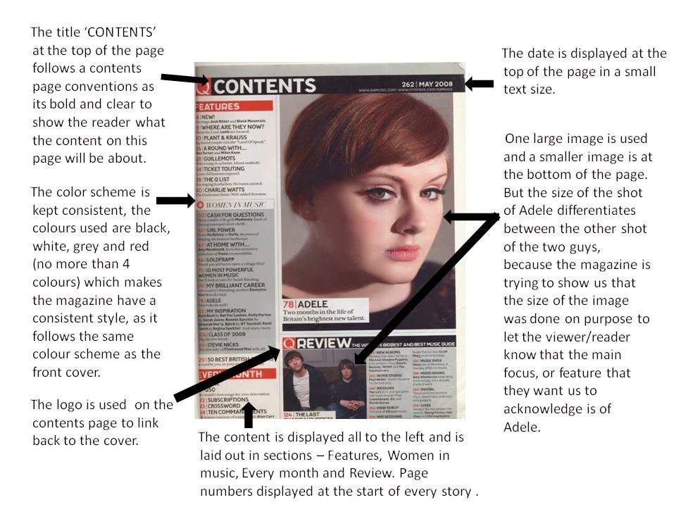
I've kept all the stories/content on the left of the page instead of laying it either side of the large image just to make it look more . I got most of my layout influences/ideas from Q Magazine Contents page. I used Q Magazines to influence my layout for my front cover so when I looked at their contents page I also found the overall look of it appealing and I know that the style of it would also appeal to my audience as the contents page is laid out clearly, in sections and has bright colorful pictures which would capture their attention.
Tuesday, 4 March 2014


Saturday, 1 March 2014

Subscribe to:
Posts (Atom)